Changing Raster Layer Style
Display of raster data in the map canvas can be enhanced using linear histogram stretching.
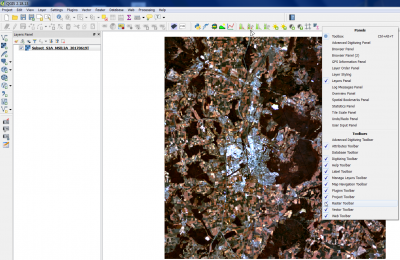
Useful Raster tools are not activated by default. Right click on the main QGIS menu and activate the checkbox as seen on the screenshot. A new Raster Toolbar is now available on the main menu.
 .
.
Contents |
Render type: multiband file
- Click the Add raster layer
 and select the file C:/OSGeo4W64/geodata/raster/s2/Subset_S2A_MSIL2A_20170619T.tif.
- After clicking Open, the raster layer appears on the QGIS canvas.
- Right click the layer name in the Layer Panel and select Properties --> Style.
- Change the assignment of bands of the multiband color.
- True Color composite.
- Red band: Band 04
- Green band: Band 03
- Blue Band: Band 02
In case of our Sentinel-2 example file this is a typical True Color composite. You need to be sure about the rank and assignment of spectral bands which depends on the sensor type.
- Standard false color:
- Red band: Band 08
- Green band: Band 04
- Blue Band: Band 03
- False color
- Red band: Band 11
- Green band: Band 08
- Blue Band: Band 03
You are free to try other band combinations to produce color composites. Find the best color composite to distingiush forests, urban areas and agriculture.
- The color composites may be enhanced in the Style menu by unfolding the 'Load min/max values. Select Stretch to MinMax. As default a tail clip of the lower 2% and upper 2% counts of the cumulative band histograms is activated. Activate the checkbox Clip extent to canvas. Only the values inside the image extent shown in the map canvas are now taken into account. Click on Load and Apply. The image display is now enhanced.
- Select radio button Mean +/- standard deviation x radio button. After adjusting the standard deviation factor (a value between 1 and 2), click Load and confirm with Apply. Evaluate the image display in the map canvas.
Note, same effects but much faster can be reached by using the Raster Toolbar of the main Menu:
Render Type: Singleband gray
Render Type: Singleband pseudocolor
- Pseudocolor is not to be mistaken for false color, the latter one being a composite of three bands. See also: Pseudocolor in Wikipedia
Pseudocolor is a way to display a raster map in which the color scale is derived from a single grayscale band. It can be a good alternative to grayscale if it comes to display metric data like elevation or temperature.
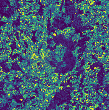
To change map color and symbology, again select the layer in the TOC with a right click and select Properties --> Style. From the pulldown menu Render type, select Singleband pseudocolor. A different menu will come up, where you may select the style of the color map in the section Generate new color map. Click classify and confirm with Apply or OK. The map should now appear in the selected style (figure C).
