Changing Raster Layer Style
(→Render Type: Singleband pseudocolor) |
(→Render type: multiband file) |
||
| (2 intermediate revisions by one user not shown) | |||
| Line 24: | Line 24: | ||
* False-Color Infrared: (B8, B4, B3) = (7,3,2) | * False-Color Infrared: (B8, B4, B3) = (7,3,2) | ||
* False-Color Urban: (B12, B11, B4) = (10,9,3) | * False-Color Urban: (B12, B11, B4) = (10,9,3) | ||
| − | * Agriculture: (B11, B8, B2) = ( | + | * Agriculture: (B11, B8, B2) = (9,7,1) |
* Atmospheric Penetration: (B12, B11, B8A) = (10,9,8) | * Atmospheric Penetration: (B12, B11, B8A) = (10,9,8) | ||
| − | * Healthy Vegetation: (B8, B11, B2) = (7, | + | * Healthy Vegetation: (B8, B11, B2) = (7,9,1) |
| − | * Land/Water: (B8, B11, B4) = (7, | + | * Land/Water: (B8, B11, B4) = (7,9,3) |
* Natural with Atmospherical Removal: (B12, B8, B3) = (10,7,2) | * Natural with Atmospherical Removal: (B12, B8, B3) = (10,7,2) | ||
| Line 34: | Line 34: | ||
[[File:Qgis_linear_contrast_stretch.png|600px]] | [[File:Qgis_linear_contrast_stretch.png|600px]] | ||
| − | # Select the radio button {{button|text=Mean +/- standard deviation x}} radio button. | + | # Select the radio button {{button|text=Mean +/- standard deviation x}} radio button. Adjust the standard deviation factor (a value between 1 and 2), confirm with {{button|text=Apply}}. Evaluate the image display in the map canvas. |
Note, same effects but much faster can be reached by using the Raster Toolbar of the main Menu: | Note, same effects but much faster can be reached by using the Raster Toolbar of the main Menu: | ||
#*[[File:Qgis_cum_stretch.png]] Linear stretch using 2% cumulative count | #*[[File:Qgis_cum_stretch.png]] Linear stretch using 2% cumulative count | ||
| Line 47: | Line 47: | ||
Pseudocolor is a way to display a raster map in which the color scale is derived from a single [[grayscale]] band. It can be a good alternative to grayscale if it comes to display metric data like spectral indices, elevation or temperature. | Pseudocolor is a way to display a raster map in which the color scale is derived from a single [[grayscale]] band. It can be a good alternative to grayscale if it comes to display metric data like spectral indices, elevation or temperature. | ||
| − | To change map color and symbology, select the layer (e.g. a single band Sentinel-2 image) in the [[TOC]] with a right click and select {{mitem|text=Properties --> | + | To change map color and symbology, select the layer (e.g. a single band Sentinel-2 image) in the [[TOC]] with a right click and select {{mitem|text=Properties --> Symbology}}. From the pulldown menu '''Render type''', select {{button|text=Singleband pseudocolor}}. |
A different menu will come up, where you may select different '''Color ramps'''. Click {{button|text=Classify}} and {{button|text=OK}}. The single band raster should now appear with the selected color table ('''figure C'''). | A different menu will come up, where you may select different '''Color ramps'''. Click {{button|text=Classify}} and {{button|text=OK}}. The single band raster should now appear with the selected color table ('''figure C'''). | ||
Latest revision as of 10:36, 27 October 2021
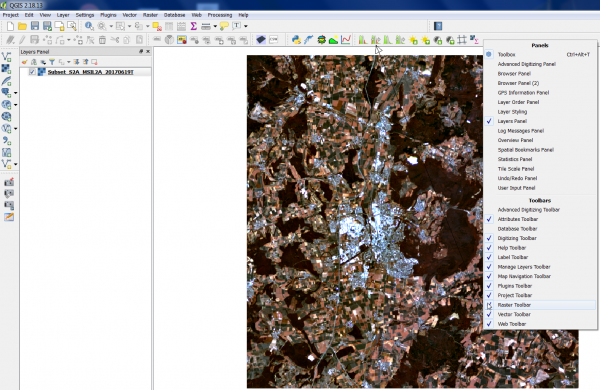
Display of raster data in the map canvas can be enhanced using linear histogram stretching. Useful Raster tools are not activated by default. Right click on the main QGIS menu and activate the checkbox as seen on the screenshot. A new Raster Toolbar is now available on the main menu.
Contents |
[edit] Render type: multiband file
- Click the Open Data Source Manager
 and then Add raster layer
  and select a virtual stack or a multiband raster file.
- After clicking Open, the raster layer appears on the QGIS canvas.
- Right click the layer name in the Layer Panel and select Properties --> Symbology.
- Change the assignment of Red, Green, Blue to band numbers and create color composites.
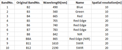
Attention: usually the assignment refers to the original spectral band numbers which might be a different rank in the multiband file. Pick the corresponding No. according to the rank in the multiband file.
- True Color composite.
- Red band: Original B4, BandNo. 3
- Green band: Original B3, BandNo.2
- Blue Band: Original B2, BandNo. 1
In case of the Sentinel-2 example file this is a typical True Color composite.
Try other band combinations and produce false color composites.
- Natural Colors: (B4, B3, B2) = (3,2,1)
- False-Color Infrared: (B8, B4, B3) = (7,3,2)
- False-Color Urban: (B12, B11, B4) = (10,9,3)
- Agriculture: (B11, B8, B2) = (9,7,1)
- Atmospheric Penetration: (B12, B11, B8A) = (10,9,8)
- Healthy Vegetation: (B8, B11, B2) = (7,9,1)
- Land/Water: (B8, B11, B4) = (7,9,3)
- Natural with Atmospherical Removal: (B12, B8, B3) = (10,7,2)
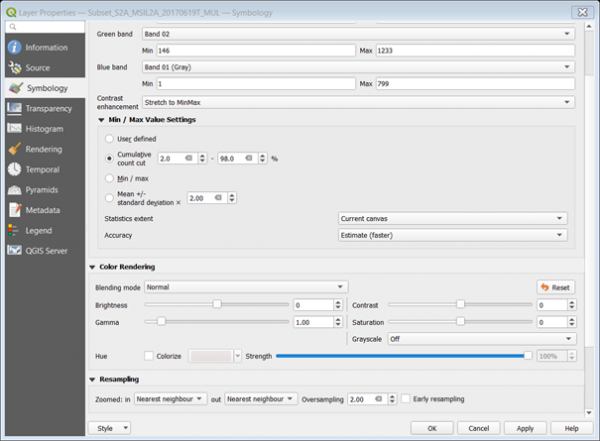
Color composites and single band raster files may be enhanced in Layer --> Layer Properties --> Symbology. Unfold the Min / Max Value Settings. As default a tail clip of the lower 2% and upper 2% counts of the cumulative band histograms is activated. Choose the Statistics extent Current canvas. Only the values inside the cuurent image extent shown in the map canvas are now considered. For Accuracy choose Actual (slower). The image display is enhanced by a linear stretch with tail clipping adopted to the histogram of current map canvas.
- Select the radio button Mean +/- standard deviation x radio button. Adjust the standard deviation factor (a value between 1 and 2), confirm with Apply. Evaluate the image display in the map canvas.
Note, same effects but much faster can be reached by using the Raster Toolbar of the main Menu:
[edit] Render Type: Singleband gray
[edit] Render Type: Singleband pseudocolor
- Pseudocolor is not to be mistaken for false color, the latter one being a composite of three bands. See also: Pseudocolor in Wikipedia
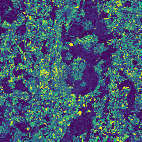
Pseudocolor is a way to display a raster map in which the color scale is derived from a single grayscale band. It can be a good alternative to grayscale if it comes to display metric data like spectral indices, elevation or temperature.
To change map color and symbology, select the layer (e.g. a single band Sentinel-2 image) in the TOC with a right click and select Properties --> Symbology. From the pulldown menu Render type, select Singleband pseudocolor. A different menu will come up, where you may select different Color ramps. Click Classify and OK. The single band raster should now appear with the selected color table (figure C).


